The world is full of numerous hidden clues and open secrets, funny ones like a brush that can also serve as a bottle, ingenious ones like a hidden door leading to a secret room, etc. The feeling you get when you discover these open clues and secrets hidden in plain sight varies from surprise to disbelief. We have compiled a list of some of these things for you, seeing them will definitely blow your mind.
Tour De France Logo
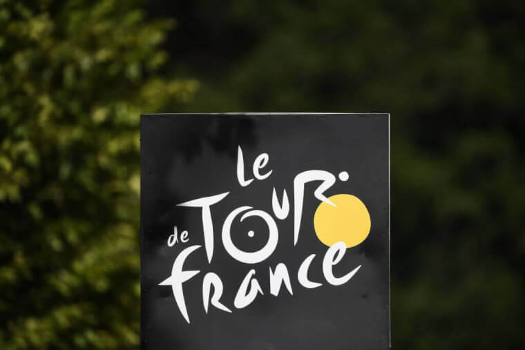
Unarguably the biggest event in cycling, the Tour de France logo is a tribute to the sport. On the face of it, it is just letters in irregular fonts spelling out what we already know, but the key to discovering the hidden message is by focusing on the word “tour”. This iconic logo was introduced in 2003 to commemorate 100 years, the “O” in tour stands for the back wheel of the bicycle while the yellow circle represents the front wheel and yellow jerseys worn by winners of each stage of the race. The “R” is transformed to look like a rider.
Baskin Robbins Logo
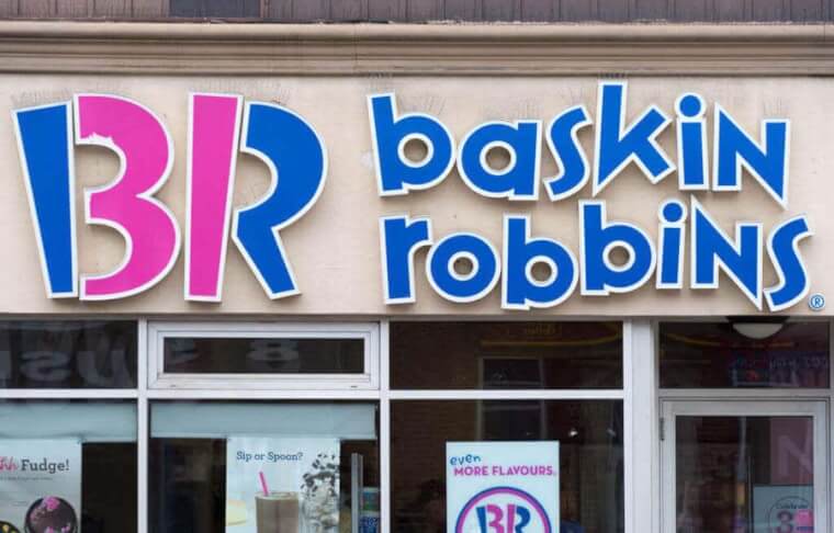
Baskin Robbins logo is fun to look at, catchy in appearance with colors and fonts which make it look like a kid’s Fine Art homework. You will be surprised to discover there is more to it than all that. If you look closely, you will discover something – the pink isn’t just there to add more color to the logo, it emphasizes figure 31. The number ‘31’ represents the number of original flavors that the ice cream company started within 1948. It was the first ice cream shop to introduce sampling before buying. To this day, Baskin Robbins still pays homage to the original 31.
Toyota Logo
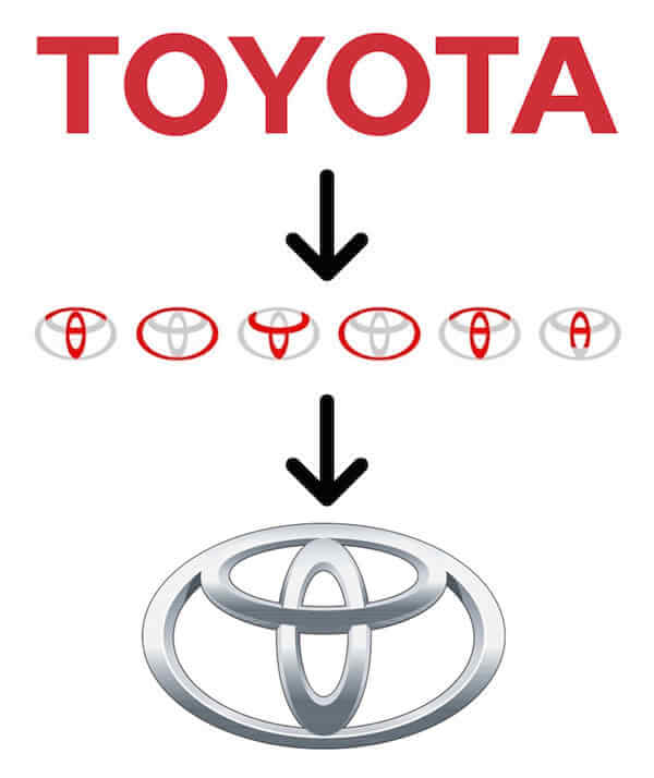
Car logos are not without their own hidden meanings too, and the logo of Toyota will show you that. According to official sources, the three ellipses on the logo represent “the unification of the heart of our customers and the heart of Toyota products” while the white space in the background symbolizes “Toyota’s technological advancement and boundless opportunities ahead.” However, this is not the only explanation for the logo. Some people believe the logo looks like a thread passing through the eye of a needle and this is to symbolize Toyota’s beginning in the textile industry. Find a more symbolic message in the next post.
Amazon Logo

You can find anything on Amazon and this company wants you to know that once you look at the logo. A simple and effective logo with an arrow moving from A to Z is not a coincidence at all. Amazon’s logo wasn’t always like this, the first logo that was used when Jeff Bezos started in 1994 was nothing compared to this in terms of creativity, as the company expanded its products and began offering other things apart from books, the logo was modified. It was not until the year 2000 that they started using this one.
FedEx Logo
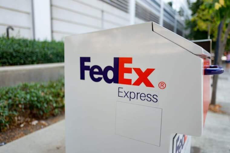
FedEx logo is a definition of simple yet ingenious, a capitalization on the negative space between “E” and “x” to create an arrow that points right or forward. The courier service company is a household name everywhere. It is said that the arrow represents speed and accuracy, a message any courier service company will want to pass across to its customers. Although the company was founded in 1971, it wasn’t until 1996 that this symbolic logo was created.
Pittsburgh Zoo Logo
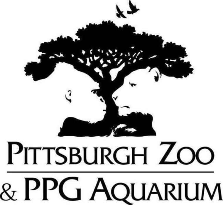
Pittsburgh Zoo logo is an amazing work of art. In simple colors of white and black, this is a logo with more than one secret hidden within. At first glance, it’s just another tree with birds flying at the top. But look closer. Have you seen the lion and gorilla staring into each other’s faces in the negative space around the tree? If you saw that, did you see the fishes leaping out of what looks like a stream at the root of the tree? You cannot but give credit to whoever created this.
Hershey’s Kisses Logo
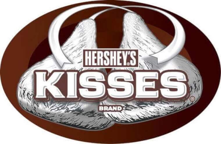
If you are looking for a hidden message in any logo, your best bet is to look into the negative space. The logo of Hershey’s Kisses confirms that, but you may be too focused on eating the cookies to notice. The logo of their Hershey’s Kisses cookies is such that the “K” and the “I” meet to form the shape of one of their chocolate kisses with the negative space in between them. While this logo is a recent development, it matches the shape of a Hershey kiss which hasn’t changed since 1907.
BMW Logo
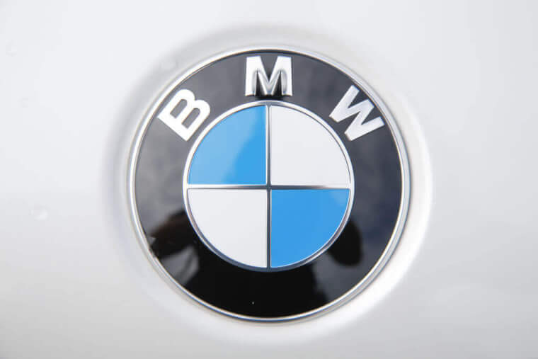
There are two varying opinions on what the blue and white logo of BMW truly represents. The enduring belief is that it represents a propeller due to the origin of the company as an engine manufacturer after the first World War. Not everyone agrees with this, there is another opinion that the blue and white represents a tribute to the flag of Bavaria where the company started. Either way, the two theories appear to have a certain validity to them and definitely give the customer something to think about.
LG Logo
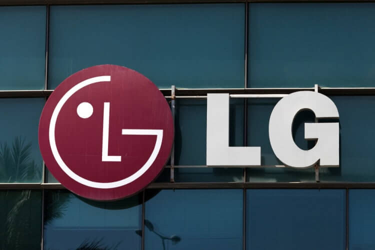
The logo of LG Electronics appears to be a winking emoji face at first glance. On a closer look, you will discover that G is the outline of the face while L represents the nose. According to some fans, LG’s logo resembles a modified Pacman.
A Lookout Atop The Statue of Liberty
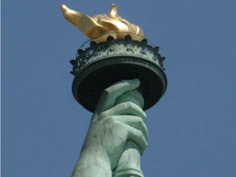
Imagine standing in the balcony holding a torch, on the statue of liberty. The glorious feeling of looking at the vast space around you. Many people have had this chance in the past when there was a staircase leading to the place. However, it was destroyed in 1916 by an explosion but later replaced in 1986.