Real estate agent Venessa Van Winkle is good at her job. But she also knows that there are some homes on the market that are bizarre and, in some cases, hideous. Even though she’s good, some properties are just impossible to sell. So, she asked her fellow agents to take snaps of some of the worst design fails they found on the job, and then she shared them online.
Searching for the Absolute Worse
Venessa Van Winkle had been in the real estate business for a while. So, she knows that every designer has their own idea of beauty. Now she’s seen some awful things in her day, so she challenged her fellow agents to find the worst design fails ever and they didn’t disappoint her.
It Missed Its Mark
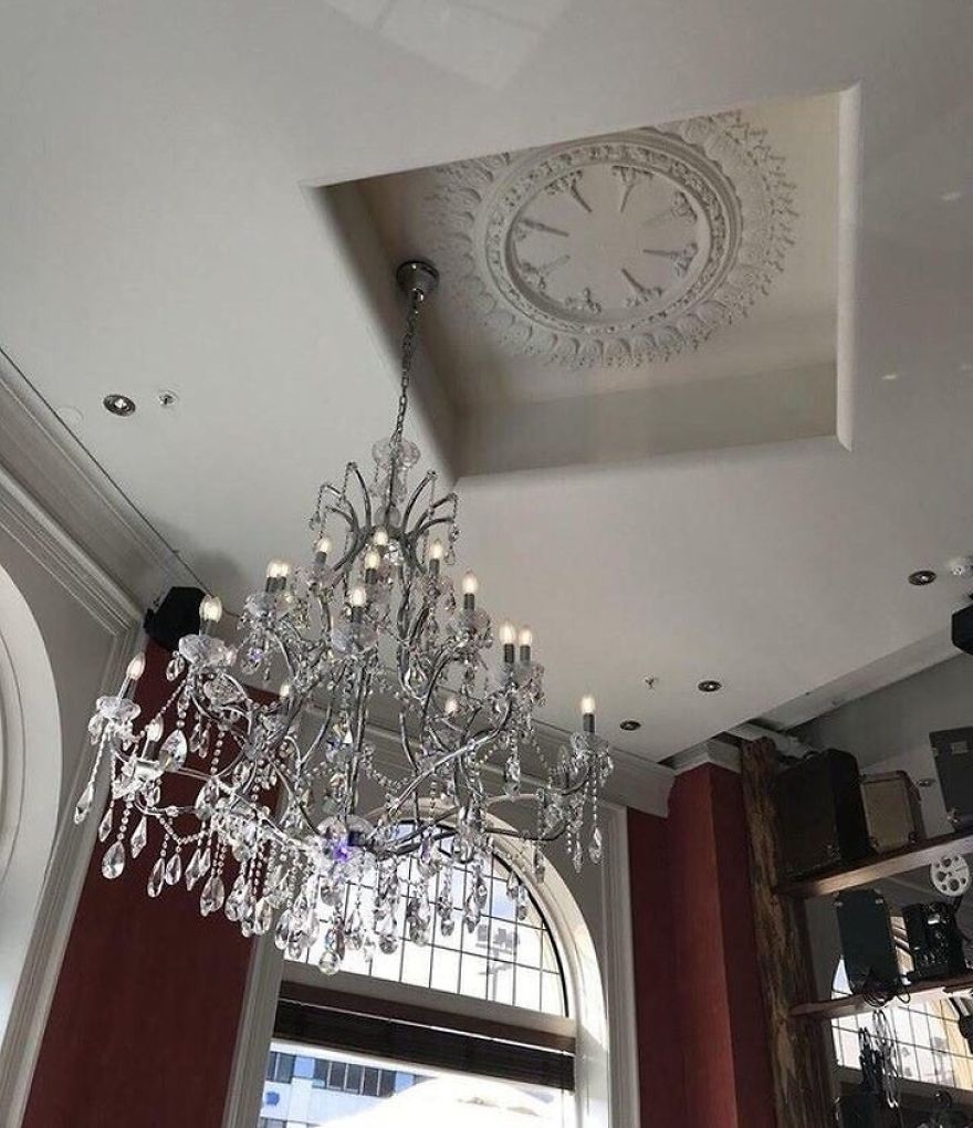
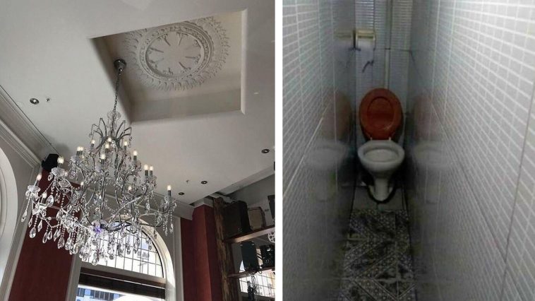
That chandelier is pretty, but it was obviously designed to go in the middle of that circle within the square area of the ceiling. Maybe the designer was in a rush and just decided to stick the chandelier somewhere random.
Roll Into the Tub
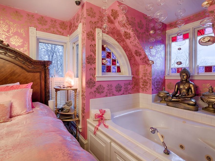
Most people are afraid of slipping and falling into a tub. But this designer placed a tub next to the bed so the person can just roll into it whenever they feel like taking a shower right after waking up. Also, what’s up all the pink? It’s like someone hosed this room down with Pepto Bismol!
Gossip Toilet
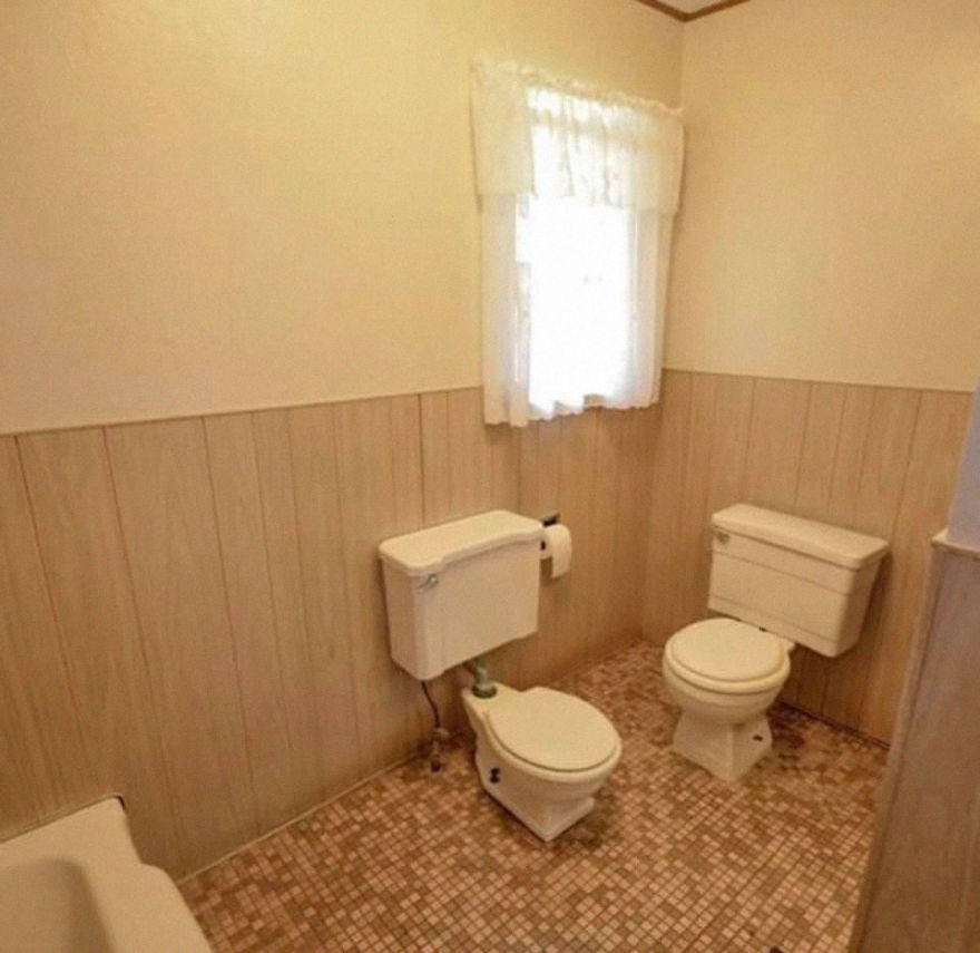
People talk through the door while they do their business. But if you own this house with two toilets in the same bathroom, you can continue having an interesting conversation while you go number 1 or number 2.
How ‘Amooosing’
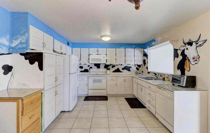
We’re sure that the real estate agents milked the cow puns for weeks after taking a snap of this ridiculous cow-themed kitchen. Whoever designed this put the cow in de-cow-rating. But whoever lived her before undoubtedly ‘mooooved’ because of this kitchen.
The Flower Invasion
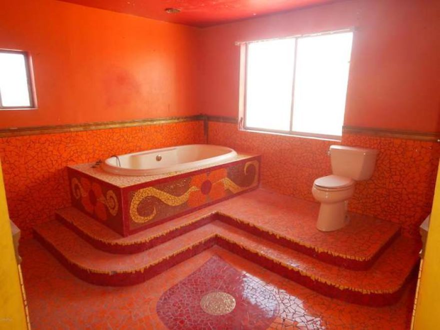
The entire bathroom seems to be covered in flower-printed carpets and we do mean everything! Even the toilet and the walls weren’t spared. The designer must have been a huge fan of flowers to do this.
The Upside-Down Door
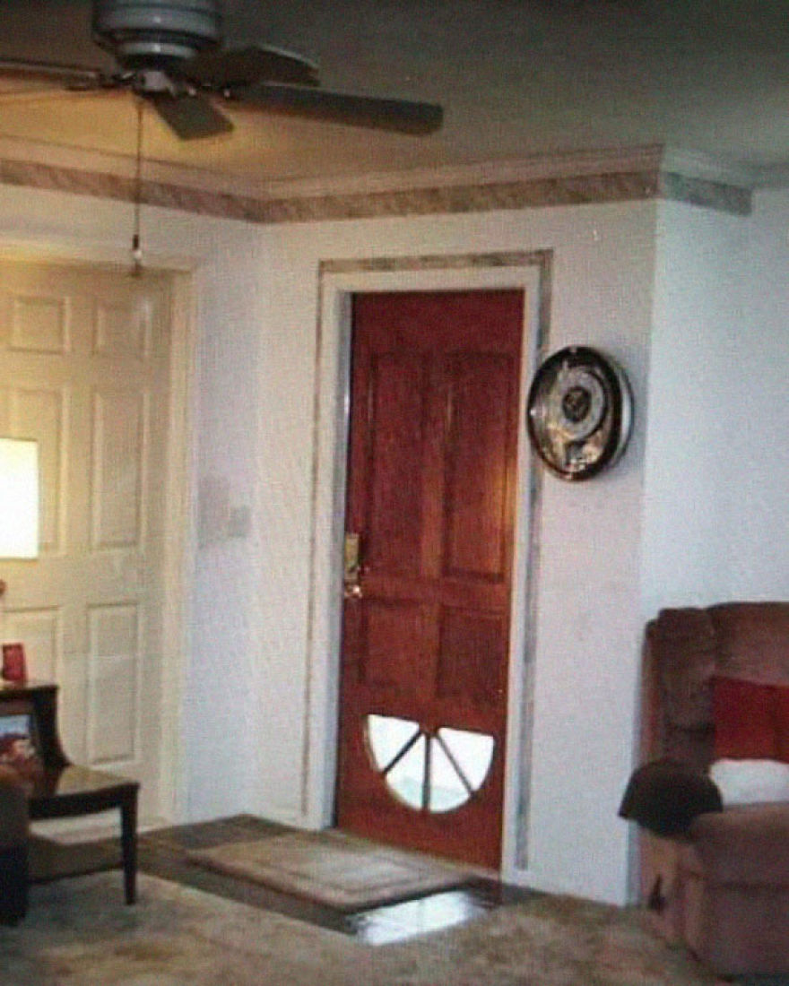
Most people rely on doors with windows, so they can let some sunlight indoors or to see who it is that’s knocking on the door. But this door was placed upside down, so the only way you’ll recognize anyone is by what their footwear looks like.
The Triangular Mirror Design
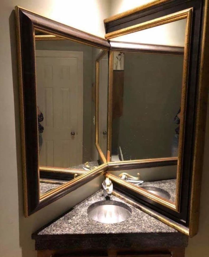
You’ll feel like a vampire because these mirrors won’t catch your reflection the way they’ve been set up. However, if you lean forward, you’ll be able to see your good and your bad side. But be careful or you might bump your head on the mirror.
The Claustrophobic Toilet
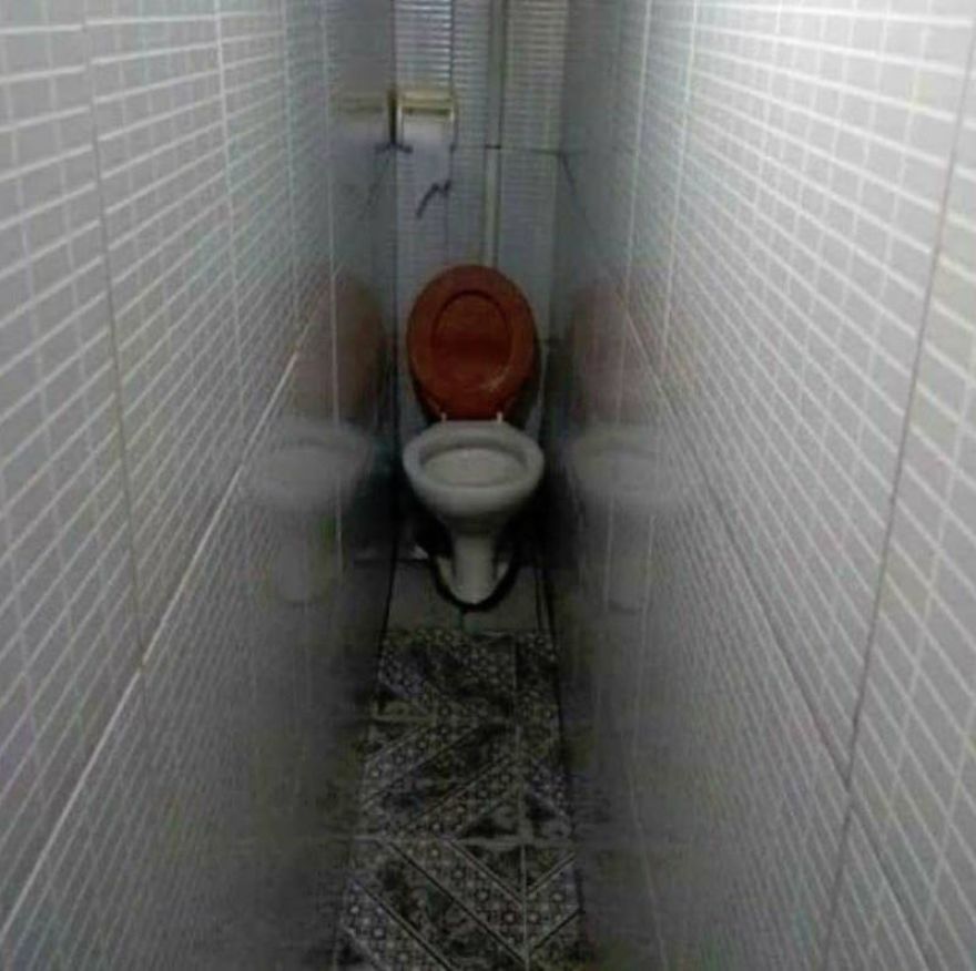
Just looking at how narrow this bathroom is would make most people hyperventilate a bit. There’s just no way anyone would be able to sit comfortably on that thing unless they’re like 5 years old or something.
Carpet on the Tub
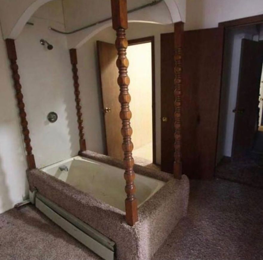
What was the designer thinking when they decided to put carpet on and all around the tub? That’s going to get so moldy so fast. The tub itself isn’t looking so great either with all the dirt on it. It’s almost the same color as the carpet. Yikes!
Slip Downstairs
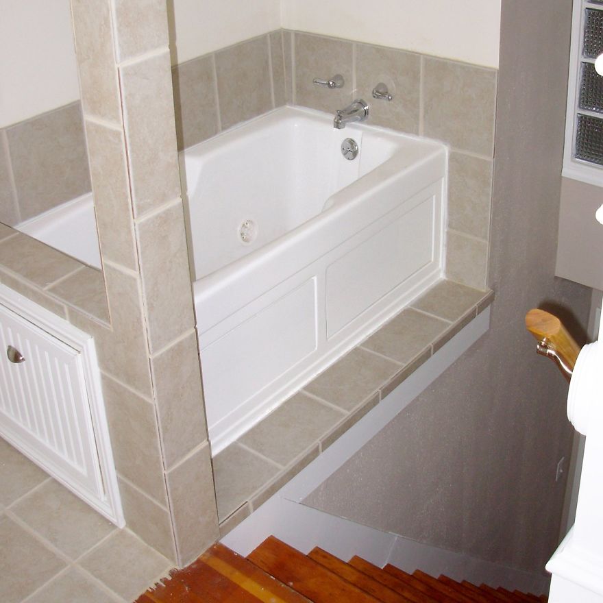
How would you like to step into a tub and have a nice relaxing bubble bath? But watch your step as you get out. It’s a long way down to the first floor. Who designs a tub right next to a set of stairs anyway?
